
From reforming measurement techniques to getting to the roots of inequality, particularly the pivotal role of education, we delved into the profound impact on economic growth, stability, crime, and health. By advocating for reduced inequality, we aim to guide the UK Government toward policies that foster societal well-being & harmony.
In this publication, we navigate the complicated scenarios of inequality, unfolding its definitions and measurement complexities. Also, unraveling income and wealth as key metrics, we scrutinize their correlations with education, happiness, and health. Our findings advocate for a reduction in inequality, positing its potential benefits for the UK population.
1. To start, we define inequality and summarise simple and complex measurement techniques. We then summarise the main causes of inequality, noting that education is a popular explanatory variable throughout. We argue that inequality is important in terms of economic growth, efficiency, stability, crime and health.
2. Given international comparisons, we conclude it is likely that the UK Government could achieve, and the UK population would benefit from, reduced levels of inequality.
3. To assess what causes inequality, and its importance, we must first attempt to defineand measure it. It could be reasonable to define inequality in terms of:
a) Income;
b) Wealth;
c) Education;
d) Happiness; and/ or
e) Health.
4. However, we can assume that income and wealth are positively correlated with education, happiness, and health, and measure inequality in terms of income and wealth, even if we are interested in a broader measure of inequality. In any event, we are conscious that there may be some circularity between these factors. For example, income and wealth are much more difficult to obtain without good health. Thus, to measure income or wealth, we may in some ways be measuring education, happiness, or health indirectly.
5.We begin with a simple measure of inequality: household income. Dividing UK households into five equally sized population groups, called quintiles, we see the top 20% earn about 10 times more gross income than the bottom 20%, while the disposable income multiple is about 6 times, as shown in Figure 1.
Figure 1: Original, gross and disposable income by quintile group, UK, financialyear end 2017
6. In the USA, we see greater disparity between the highest and lowest quintile. In 2017,the top 20% of the population in the USA earned, on average, 17 times more than the lowest 20% (see Figure 2 and Figure 3). Thus, household income in the UK in 2017was less unequal than in the USA. Income inequality in the UK in 2017 is of a similar magnitude to the level observed in the USA in 1967.
Figure 2: Gross income by quintile group, USA, 1967, 1982, 2002, and 20172
Figure 3: Household income at selected percentiles, USA, 1968-20173
7. Evolution of inequality in the USA is stark. We can compare the USA and UK to other countries, over 114 years, to observe how this inequality has changed over time.
Figure 4: Income inequality, UK compared with other countries, share of totalincome going to top 1%, 1900-20144
8. Figure 4 is interesting because we see a clear decline in income-inequality, worldwide, from 1900 to 1980. Then, English speaking countries, USA, UK, Australia, Canada and Ireland, separate from continental Europe and Japan, to become more unequal. Given the correlation between the countries until 1980, we presume that world factors (e.g.world wars) play a key role in inequality. However, country-specific factors must also play a role, from 1980 onwards.
9. Comparing different population groups is indicative, but not comprehensive. We need an overall measure of inequality that combines the different groups. The most popularis the Lorenz curve (which is used to derive a Gini coefficient).
Figure 5: The Lorenz ‘curve’ and the Gini coefficient6
10. The Lorenz ‘curve’ would be a straight line if there was perfect equality. In reality, there is always a curve. The steeper the curve the higher the inequality. The Ginicoefficient is simply the area A divided by: the area A plus the area B
11. The Lorenz curve can be applied to both income and wealth inequality. Office for National Statistics (ONS) report that income inequality is lower than wealth inequalityin the UK (see Figure 6).
Figure 6: Lorenz curve of UK income (2009/10) and UK wealth (2008/2010) 8
12. Measurement over time gives us a Gini index.
Figure 7: The GINI Index for the UK, USA, and Ireland, 1980-20149
13. Given the prominence of the Gini, we do not define or present data on other measures of inequality, such as the Theil index or the Atkinson index, in this report.
Political Systems and Institutions Taxation
14. Taxes have a material effect on inequality for two reasons:
a) Taxes allow for redistribution of income from the highest earners to the lowest earners;
b) The lowest earners can pay a much smaller proportion of tax than the highestearners.
15. Relative to other countries, the UK tax (and transfers) system is less powerful at reducing inequality. In Ireland, we see that the Gini coefficient reduces from 0.58 to 0.31, as a result of taxes and transfers, (reducing inequality by almost 50%), whereas the impact in the UK is much smaller, reducing Gini from 0.53 to 0.36.
Figure 8: Inequality of incomes before and after redistribution10
16. As a result of growing inequality in the USA, there is political pressure to update the tax system, perhaps to focus on wealth rather than income. US senator Elizabeth Warren has called for an annual levy of 2% on wealth above $50m and of 3% on wealth above$1bn. This could raise $210bn a year, her supporters say – but they assume, implausibly, limited avoidance and no economic damage. An alternative proposal (by congresswoman Cortez), for a top-tax rate of 70% on the highest incomes is estimated to raise only $12bn (5% of the tax which would be raised under Ms Warren’s proposal to tax wealth)
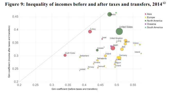
Figure 9: Inequality of incomes before and after taxes and transfers, 201412
High demand for professional and technical roles
17. Technological advancements worldwide raise demand for professionals and technical skills. Similarly, an increase in life expectancy means that there is a higher demand for healthcare professionals and associated technologies.
Figure 10: Education, unemployment and earnings, USA, 201013
18. Advances in technology increase inequality because those with higher education find it easier to gain employment and find it easier to demand higher salaries, see Figure 10.
Trade Liberalisation, Immigration and Tax avoidance
19. Globalisation gives rise to several complex factors, including:
a. Trade liberalisation;
b. Immigration;
c. Tax avoidance;
20. All three factors can increase inequality in the UK. For example, trade liberalisation can increase trade with developing nations, thus reducing world inequality, but this can decrease the wages of low-skilled domestic workers, increasing inequality in developed countries like the UK and the USA.
21. However, research suggests that the impact of immigration is small. In 2005 the International Organisation for Migration concluded:
“the economic gains from migration are small but positive, with the benefits, however, invariably distributed unequally. Most gains accrue to the migrants and owners of capital, and can have positive flow-on effects for global GDP levels. The “losers” are often the local workers with similar skills to the migrants, but again the overall losses seem minimal.”
Labour supply and demand
22. Childhood development is strongly correlated with education outcomes, which are, in turn, strongly correlated with income. If supply of high-skilled labour keeps pace with the demand, then the benefit of childhood development would be less important. However, this has not been the case.
23. Figure 11 shows that although the supply of college skills has increased, so has the wage-premium-paid for those higher skills.
Figure 11: Relative Supply of College Skills and College Premium, US, 1939-199616
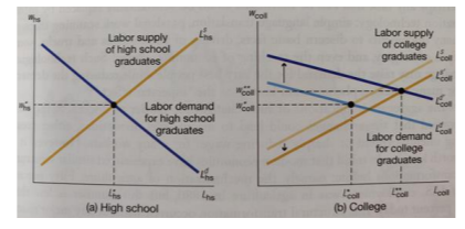
24. These supply and demand effects can be understood by considering the supply and demand curves, as demonstrated in Figure 12, where the demand effect is greater than the supply effect.
Figure 12: Using supply and demand curves to understand the rising return toeducation17
Wealth and other effects
25. Up to half of the difference in incomes can be due to family factors.
26. However, family factors are diverse, including:
a) Family wealth;
b) Family income;
c) Local environment (local economic conditions or education opportunities);
d) Social connections;
e) Genetics; and
f) Family culture.
27. The genetics and culture factors are a timely reminder than inequality is not the sameas unfairness.
28. We report the change in wealth inequality over time in Appendix 2. We note that wealth inequality is less severe in the UK than USA, France or China, although it has been increasing over the past 30 years. In Appendix 3, we highlight that income inequality and wealth inequality are typically, but not always, positively correlated. One possible explanation is that income inequality is a pre-requisite, and thus a leading indicator, of wealth inequality, as higher income is required before wealth generating capital (such as property, machinery or shares etc) can be purchased.
29. Arguably, inequality is not a bad thing if it results in economic growth and societal benefits for all (even if unequally shared). Figure 13 demonstrates that daily income per capit a has risen above the poverty line, even though inequality increased over the same period
Figure 13: Global income distribution in 1800, 1975, and 201019
30. Although Figure 13 could be used to argue that high inequality has resulted in less poverty, the correlation should not be assumed to be causation. In contrast, Figure 14indicates that higher levels of inequality, as measured by the Gini coefficient, have typically resulted in lower GDP growth in subsequent years. One weakness, however,of Figure 14, is that the years 2008 - 2012 coincide with the financial crises and low interest rates.
Figure 14: Correlation between Gini coefficients and GDP growth20
31. Arguments on economic growth are closely related to the view that there is diminishing utility from wealth. Some argue that it is efficient, in terms of overall human welfare, for income and wealth to be unevenly distributed. Put simply, some people want to work and grow successful businesses, more than others.
32. On the other hand, where inequality leads to poverty, there is inefficiency for society overall. Those who could contribute positively, participating in society and community, may not, because they cannot.
33. Increased inequality can lead to financial crises21, lack of unsustainable growth22 and increased rates of inflation.
34. It is well recognised that inequality and crime are positively correlated. This assumption holds, even when controlling for other crime determinants, such as low income and unemployment.24 Small (and permanent) decreases in inequality – such as reducing inequality from the level found in Spain (0.35 as per Figure 8 above) to that in Canada (0.32 as per Figure 8 above) – would, it is argued, reduce homicides by 20% and lead to a 23% long-term reduction in robberies.25
35. Health can be measured in many ways, including:
a) Physical health;
b) Life expectancy;
c) Mental health; and
d) Infant mortality.
36. In developed countries, and in US states, higher inequality is associated with:
a) Lower physical health26;
b) Shorter life expectancy27;
c) Poorer mental health;
d) Higher infant mortality.
37. Thus, in more unequal societies, overall levels of health, based on research findings, are much worse.
38. Given available research and international comparisons, we conclude it is likely that the UK Government could achieve, and the UK population would benefit from, reduced
levels of inequality.
39. In particular, there is scope for tax to play a greater role in equality, and we note the positive impact that reduced inequality (as measured by Gini) would have on crime and health
Acemoglu, D. (2002). Technical change, inequality, and the labor market. Journal of Economic Literature, 40(1), 7-72.
Beetsma, R., & Van Der Ploeg, F. (1996). Does inequality cause inflation?: The political economy of inflation, taxation and government debt. Public Choice, 87(1-2), 142-162.
Berg, A., & Ostry, J. (2011). Inequality and Unsustainable Growth: Two Sides of the Same Coin? Retrieved from IMF Staff Discussion Note.
Björklund, A., & Jäntti, M. (2011). Intergenerational Income Mobility and the Role of Family Background. Retrieved from Oxford Handbooks.
Fajnzylber, P., Lederman, D., & Loayza, N. (2002). Inequality and Violent Crime. Journal of Law and Economics, 45(1).
Federal Bank of St Louis. (2019). Income Gini Ratio for Households. Retrieved from FRED Economic Data.
International Organisation for Migration. (2005). World Migration Report: costs and benefits of international migration. Retrieved from World Migration Report 2005.
Jones, C. (2018). In Macroeconomics (4th ed., pp. 193-198).
Kumhof, M., & Rancière, R. (2010). IMF Working Paper. Retrieved from Inequality, Leverage and Crises.
Office for National Statistics. (2013, January). The Economic Position of Households, Q3 2012. Retrieved from ONS Archived Report.
Office for National Statistics. (2018). Household disposable income and inequality in the UK: financial year ending 2017. Retrieved from ONS Household Disposable Income and Inequality.
Pickett, K., & Wilkinson, R. (2010). In The Spirit Level: Why Equality is Better for Everyone.
Pindyck, R., & Rubinfeld, D. (2013). In 8th (Ed.), Microeconomics (pp. 29, 554-555).
Roser, M., & Ortiz-Ospina, E. (2016). Income inequality. Retrieved from Our World in Data.
The Economist. (2019, February 2nd). Taxing the Rich: a way through the warren.
United States Census Bureau. (2018). Income and Poverty in the United States: 2017. Retrieved from United States Census Bureau.
Vogli, R. D., Mistry, R., Gnesotto, R., & Cornia, G. A. (2005). Has the relation between income inequality and life expectancy disappeared? Evidence from Italy and top industrialised countries. 59(2), 158-162.
Wodon, & Yitzhaki. (n.d.). Inequality and Social Welfare. World Bank Resources. Retrieved from World Bank Resources.
Wood, A. (1994). In North-South Trade, Employment and Inequality: Changing Fortunes in a Skill-Driven World.
World Inequality Database. (2019). World Inequality Database. Retrieved from World Inequality Database
Figure 15: Income inequality, top 1% and bottom 50%, USA, 1990-201428
Figure 16: Income inequality, top 1% and bottom 50%, UK, 1990-201429
Figure 17: Income inequality, top 1%, USA, UK, France and China, 1990-201430
Figure 18: Income inequality, top 1%, USA, UK and France, 1900-201431
I was delighted that MCC's work was completed on time, and within budget, helping us deliver important changes and improvements, to the benefit of our stakeholders. MCC's report is published on the CCC website.

I am delighted to recommend MCC Economics. Specifically, I worked closely with PJ, who helped us with our Nuclear and CCUS projects. PJ helped us develop new policies and answer questions from our stakeholders. His support helped us deliver important changes and improvements, to the benefit of our stakeholders.

MCC Economics has helped us better understand the most important issues for our stakeholders, including: charges, shareholder returns, debt payments and inflation impacts.

I am delighted to recommend PJ and his team at MCC Economics. We've been working together on National Policy Statements to help meet net zero targets for 2030 and 2050. We initially appointed MCC Economics to support us on offshore wind consultation analysis and have recently reappointed MCC Economics to undertake a larger consultation analysis role across all sectors, including hydrogen, CCUS and networks. I can confirm that PJ and his team have shown excellent spreadsheet skills, alongside very good project management, planning and analysis skills, helping us deliver important changes, and continuous improvements, to the benefit of our stakeholders.

I am delighted to recommend PJ and his team from MCC Economics. They helped us with our price controls for Heathrow airport and for NATS (En Route) plc (the air traffic services provider). Specifically, the MCC team helped us deliver important changes and improvements to our financial models and supporting policy documents, to the benefit of our stakeholders.

I am delighted to confirm that I worked with PJ on a retail project in 2015. The project helped stakeholders understand electricity costs and charges. Specifically, the project helped us explain to stakeholders, internally and externally, why electricity charges differed across the regions (GB, NI & Ireland). PJ was a key member on the project team, which helped deliver changes and improvements in the understanding of energy retail.

.png)

Evidence-based analysis for transparent, defensible, and effective decision-making.
© All rights reserved – MCC Economics 2026.
.png)

%20(1).png)
.jpg)